
Texture atlases, also known as spritesheets, are a technique used by games to reduce the number of textures that need to be loaded into memory in exchange for those textures being larger. The same is also true of old websites, especially before HTTP 1.1 introduced the Keep-Alive mechanism to allow the same request to be re-used for other requests. Spritesheets allowed you to include lots of small images that you knew you needed in one hit, without having to resort to multiple connections. Typically, this involves laying out your smaller images in a grid, then using some CSS to only display part of the image at a time.
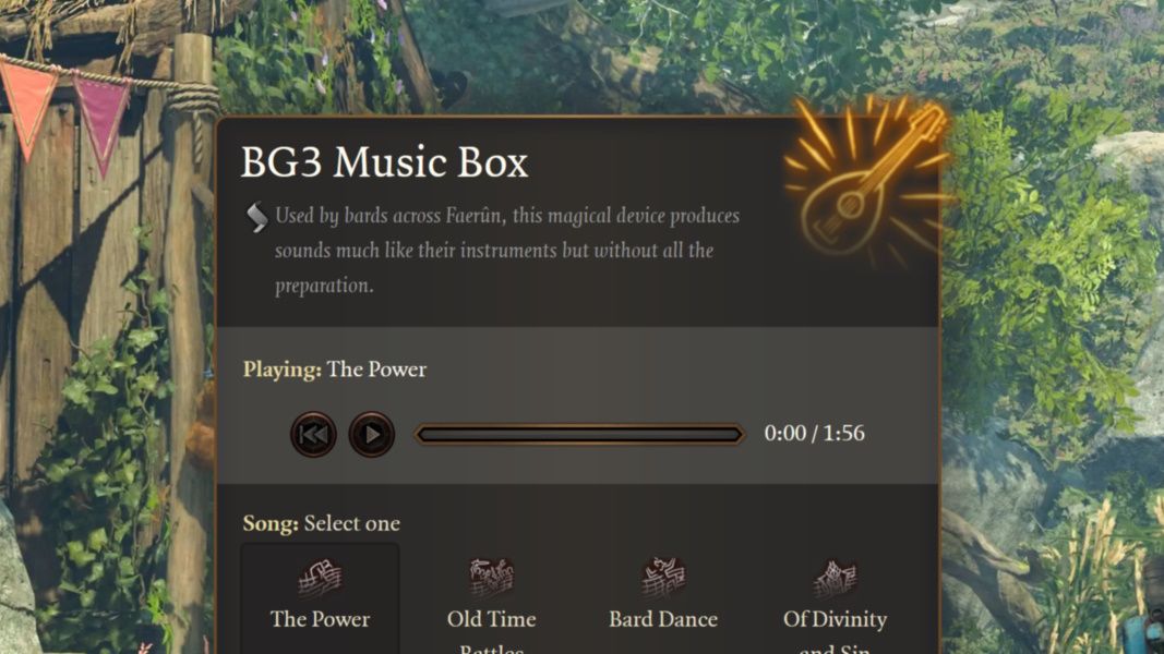
So why did I need to bring back spritesheets? Buttons. Buttons with textures. I made a small website using UI elements from Baldur’s Gate 3, and that needed buttons.
I could have used 4 separate textures for each of the states I needed (default, :hover, :active, and :disabled) but then the first time you hovered over the button there’d be a delay before the visuals of the button updated. It would be much better to include all 4 states in the same texture, then just swap out which part of the texture was being used at any time.
The CSS
If you’re just here to copy/paste some CSS, then here’s what I’ve got for you. The rest of this post will explain what’s going on. It’s widely supported across major browsers, since the main dependency here is on CSS variables.
css.sprite { --spritesheet-width: 256px; /* Add your own texture dimensions here */ --spritesheet-height: 256px; background-image: url(./img/spritesheet.png); width: calc(var(--extrinsic-width) * 1px); height: calc(var(--extrinsic-height) * 1px); --ratio-width: calc(var(--extrinsic-width) / var(--sprite-width)); --ratio-height: calc(var(--extrinsic-height) / var(--sprite-height)); background-position: calc(var(--sprite-left) * var(--ratio-width) * -1px) calc(var(--sprite-top) * var(--ratio-height) * -1px); background-size: calc(var(--spritesheet-width) * var(--ratio-width)) calc(var(--spritesheet-height) * var(--ratio-height));}/* Example usage */.sprite.example { --extrinsic-width: 64; /* The size, in browser pixels, this image should appear on screen */ --extrinsic-height: 64; /* Note that all the variables here are just numbers without units. */ --sprite-top: 0; /* Position of the texture on the spritesheet, in texture pixels */ --sprite-left: 0; --sprite-width: 64; /* Size of the texture on the spritesheet, in texture pixels */ --sprite-height: 64;}.sprite.example:hover { --sprite-left: 64;}.sprite.example:active { --sprite-left: 128;}.sprite.example:disabled { --sprite-left: 192;}
Of course, you don’t need to use this for different button states. You could also use it to hold many small icons together, something I also used this exact system for.
So how does it work?
CSS’s background properties
This whole system revolves around CSS’s background-image property. This should make you a bit cautious, since the best and most accessible way to include images on your page is with the <img> tag. In general, if you can do it with <img> tags, then that’s the way you should solve it.
The next property that’s used by spritesheets is background-position. This tells the browser where in the browser’s layout the top-left for the texture should be. Ultimately, this means the value you want to pick for this should be the negative of where the top-left pixel in your texture is. This is because you want to shift the origin of the texture outside of the bounds of the element so the “window” of the element shows the correct content.
This all works perfectly if the size of your element matches up with the size in the texture, but it doesn’t look right when there’s a difference between the two. One approach would be to have separate textures for each size of the image, then swap the background-position at the same time as the width/height in the media queries. This would work, but it would also require having multiple instances of the texture in the sheet at a time. A problem with this, though, is that it assumes a 1:1 ratio between browser pixels and device pixels. This simply is not a safe assumption to make. Modern displays, both in mobile and desktop scenarios, have higher resolutions within the same physical size. This leads to device pixels being separate from browser pixels (and again possibly different again to texture pixels).
I wanted to have some support for higher density displays, so I added in the background-size property instead. If we made, say, a 64x64 <div> and set its background-image to our sheet, then it’s going to use a 64x64 area from the texture to draw that. Instead, we need to instruct the browser to pretend the texture is a different size so more/less of it is visible within the element. Halving the background-size relative to the texture size would make our example 64x64 element draw a 128x128 area of the texture as its background, which would appear sharper to users on a 2x pixel ratio screen. Users on a 1x pixel ratio screen would see something similar to what they did before, thanks to browsers automatically downscaling during rasterisation.
Explaining the variables
I remember dealing with spritesheets early on in my time with the web, and it always struck me as a bit of an annoyance, especially when texture sizes didn’t match up with the size I wanted in the browser.
An upshot of this system is that it can be made general enough to work with any size of element or sprite on the texture with minimal hassle. That’s exactly what the set of CSS variables in the code above do.
First there’s a set of variables that need to be known:
-
--spritesheet-width and --spritesheet-height need to have the dimensions of the image you will be loading in as a spritesheet.
-
--extrinsic-width and --extrinsic-height are the dimensions of the elements in browser pixels. These need to be unit-less, as they get used in the calculations ad those don’t work with units.
-
--sprite-top, --sprite-left, --sprite-width, and --sprite-height describe the area of the texture that you want to show in the element. Again, these need to be written without units.
With those, we can fully calculate everything else we need to display the sprite properly. Both the background-position and background-size properties are affect by any scaling we do, so we also need to calculate the ratio between the size on-screen and the size of the section of texture we’re using. This just get multiplied in.
-
background-position needs to be multiplied by -1 to ensure we move the origin of the texture in the correct direction. Other than that, we just need to multiply our texture coordinates by the scaling ratio and the browser will position the background correctly.
-
background-size need to be the size of the whole spritesheet texture multiplied by the scaling ratio.
And that’s it. With only a few understandable variables and some basic multiplication, spritesheets are easy again. Again, I’d like to stress that this isn’t something that should be used everywhere. It’s a special technique to achieve a certain goal, but also mean you need to handle any accessibility or related browser interactions yourself. It may just be more work to use a spritesheet. That’s a call you need to make yourself in your own projects, but for mine I know it was the right one to make.